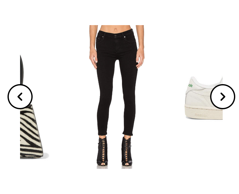
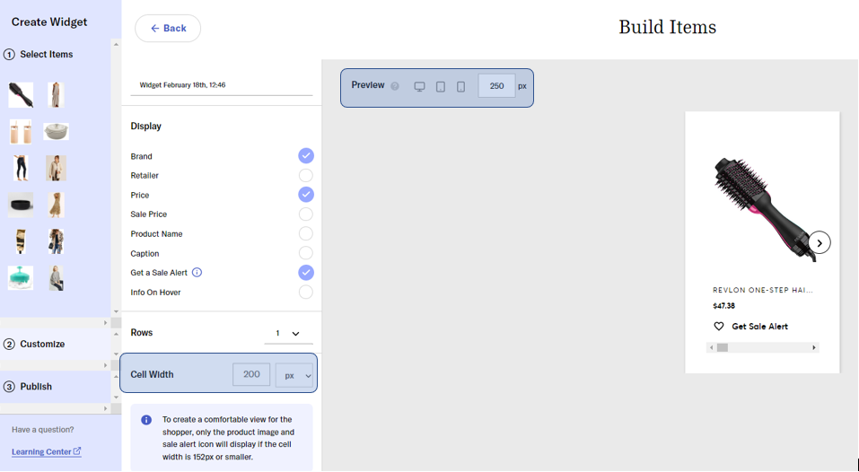
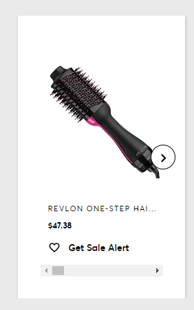
Widgets feature a sneak peak of the next product in your widget. This increases engagement within the product cells and drives more traffic! Here's an example:

Pro tip: If you have a widget, such as a 1x1 widget, featured on your blog and you don't want to have this sneak peek, here's a workaround:
- Match the pixels to the custom display size up top
- The custom display size up top will need to match the container size featured on your blog
- These are the fields to adjust:


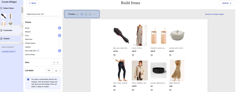
Preview your Widget and Adjust the Cell Width
Preview allows you to see how your widget will render on desktop, tablets, and mobile devices.
Cell Width allows you to adjust the size of your product image in your widget and control how it renders on touch screen devices, like mobile web on a phone or tablet.
- Pro tip: Play around with Cell Width and explore how it renders on the third option, mobile devices, to create the desired experience!

Preview
Preview your widget as it will appear on different size devices, such as tablets, desktop or laptop screens, and mobile devices.
Pro tip: If you notice your widgets look different than expected on your blog, use the
